As mentioned previously, a typical WPF window will not use a single panel control, but instead will nest panels within other panels to gain the desired layout system. The next step is to learn how to nest panels, as well as how to use a number of new WPF controls. You will learn this by building a simple WPF word processor application. Begin by opening Visual Studio 2010 and creating a new WPF Application named MyWordPad.
Your goal is to construct a layout where the main window has a topmost menu system, a toolbar under the menu system, and a status bar mounted on the bottom of the window. The status bar will contain a pane to hold text prompts that are displayed when the user selects a menu item (or toolbar button), while the menu system and toolbar will offer UI triggers to close the application and display spelling suggestions in an Expander widget. Figure 28-14 shows the initial layout you are shooting for; it also displays spelling suggestions for XAML.
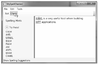
Figure 28-14 Using nested panels to establish a window’s UI
Notice that the two toolbar buttons are not supporting an expected image, but a simple text value. This would not be sufficient for a production-level application, but assigning images to toolbar buttons typically involves using embedded resources, a topic that you will examine in Chapter 30 (so text data will do for now). Also note that, as the mouse button is placed over the Check button, the mouse cursor changes and the single pane of the status bar displays a useful UI message.
To begin building this UI, update the initial XAML definition for your Window type so it uses a <DockPanel> child element, rather than the default <Grid>:
<Window x:Class="MyWordPad.MainWindow"
    xmlns="http://schemas.microsoft.com/winfx/2006/xaml/presentation"
    xmlns:x="http://schemas.microsoft.com/winfx/2006/xaml"
    Title="MySpellChecker" Height="331" Width="508"
    WindowStartupLocation ="CenterScreen" >

    <!-- This panel establishes the content for the window -->
    <DockPanel>
    </DockPanel>
</Window>
Menu systems in WPF are represented by the Menu class, which maintains a collection of MenuItem objects. When building a menu system in XAML, you can have each MenuItem handle various events. The most notable of these events is Click, which occurs when the end user selects a sub-item. In this example, you begin by building the two topmost menu items (File and Tools; you will build the Edit menu later in this example), which expose Exit and Spelling Hints sub-items, respectively.
In addition to handling the Click event for each sub-item, you also need to handle the MouseEnter and MouseExit events, which you will use to set the status bar text in a later step. Add the following markup within your <DockPanel> scope (feel free to use Properties window of Visual Studio 2010 to help minimize the amount of markup you need to type by hand):
<!--Dock menu system on the top-->
<Menu DockPanel.Dock ="Top"
        HorizontalAlignment="Left" Background="White" BorderBrush ="Black">
    <MenuItem Header="_File">
        <Separator/>
        <MenuItem Header ="_Exit" MouseEnter ="MouseEnterExitArea"
            MouseLeave ="MouseLeaveArea" Click ="FileExit_Click"/>
        </MenuItem>
        <MenuItem Header="_Tools">
        <MenuItem Header ="_Spelling Hints"
            MouseEnter ="MouseEnterToolsHintsArea"
            MouseLeave ="MouseLeaveArea" Click ="ToolsSpellingHints_Click"/>
        </MenuItem>
</Menu>
Notice that you dock the menu system to the top of the DockPanel. Also, you use the <Separator> element to insert a thin horizontal line in the menu system, directly before the Exit option. Also notice that the Header values for each MenuItem contain an embedded underbar token (e.g., _Exit). You use this token to establish which letter will be underlined when the end user presses the Alt key (for keyboard shortcuts).
So far you’ve implemented the complete the menu system definition; next, you need to implement the various event handlers. First, you have the File > Exit handler, FileExit_Click(), which simply closes the window, which in turn terminates the application because this is your topmost window. The MouseEnter and MouseExit event handlers for each sub-item will eventually update your status bar; however, for now, you will simply provide shells. Finally, the ToolsSpellingHints_Click() handler for the Tools > Spelling Hints menu item will also remain a shell for the time being. Here are the current updates to your code-behind file:
public partial class MainWindow : System.Windows.Window
{
    public MainWindow()
    {
        InitializeComponent();
    }

    protected void FileExit_Click(object sender, RoutedEventArgs args)
    {
        // Close this window.
        this.Close();
    }

    protected void ToolsSpellingHints_Click(object sender, RoutedEventArgs args)
    {
    }

    protected void MouseEnterExitArea(object sender, RoutedEventArgs args)
    {
    }

    protected void MouseEnterToolsHintsArea(object sender, RoutedEventArgs args)
    {
    }

    protected void MouseLeaveArea(object sender, RoutedEventArgs args)
    {
    }
}
Toolbars (represented by the ToolBar class in WPF) typically provide an alternative manner for activating a menu option. Add the following markup directly after the closing scope of your <Menu> definition:
<!-- Put Toolbar under the Menu -->
<ToolBar DockPanel.Dock ="Top" >
    <Button Content ="Exit" MouseEnter ="MouseEnterExitArea"
        MouseLeave ="MouseLeaveArea" Click ="FileExit_Click"/>
    <Separator/>
    <Button Content ="Check" MouseEnter ="MouseEnterToolsHintsArea"
        MouseLeave ="MouseLeaveArea" Click ="ToolsSpellingHints_Click"
        Cursor="Help" />
</ToolBar>
Your ToolBar control consists of two Button controls, which just so happen to handle the same events and are handled by the same methods in your code file. Using this technique, you can double-up your handlers to serve both menu items and toolbar buttons. Although this toolbar uses the typical push buttons, you should appreciate that the ToolBar type “is-a” ContentControl; therefore, you are free to embed any types into its surface (e.g., drop-down lists, images, and graphics). The only other point of interest here is that the Check button supports a custom mouse cursor through the Cursor property.
Note You can optionally wrap the ToolBar element within a <ToolBarTray> element, which controls layout, docking, and drag-and-drop operations for a set of ToolBar objects. Consult the .NET Framework 4.0 SDK documentation for details.
A StatusBar control will be docked to the lower portion of the <DockPanel> and contain a single <TextBlock> control, which you have not used prior to this point in the chapter. You can use a TextBlock to hold text that supports numerous textual annotations, such as bold text, underlined text, line breaks, and so forth. Add the following markup directly after the previous ToolBar definition:
<!-- Put a StatusBar at the bottom -->
<StatusBar DockPanel.Dock ="Bottom" Background="Beige" >
    <StatusBarItem>
        <TextBlock Name="statBarText" Text="Ready"/>
    </StatusBarItem>
</StatusBar>
The final aspect of your UI design is to define a splittable Grid that defines two columns. On the left you place an Expander control that will display a list of spelling suggestions, wrapped within a <StackPanel>. On the right, you place a TextBox control that supports multiple lines and scrollbars, and includes enabled spell checking. You mount the entire <Grid> to the left of the parent <DockPanel>. Add the following XAML markup directly under the markup describing the StatusBar to complete the definition of our Window’s UI:
<Grid DockPanel.Dock ="Left" Background ="AliceBlue">
    <!-- Define the rows and columns -->
    <Grid.ColumnDefinitions>
        <ColumnDefinition />
        <ColumnDefinition />
    </Grid.ColumnDefinitions>

    <GridSplitter Grid.Column ="0" Width ="5" Background ="Gray" />
    <StackPanel Grid.Column="0" VerticalAlignment ="Stretch" >
        <Label Name="lblSpellingInstructions" FontSize="14" Margin="10,10,0,0">
            Spelling Hints
        </Label>

        <Expander Name="expanderSpelling" Header ="Try these!"
                Margin="10,10,10,10">
            <!-- This will be filled programmatically -->
            <Label Name ="lblSpellingHints" FontSize ="12"/>
        </Expander>
    </StackPanel>

    <!-- This will be the area to type within -->
    <TextBox Grid.Column ="1"
        SpellCheck.IsEnabled ="True"
        AcceptsReturn ="True"
        Name ="txtData" FontSize ="14"
        BorderBrush ="Blue"
        VerticalScrollBarVisibility="Auto"
        HorizontalScrollBarVisibility="Auto">
    </TextBox>
</Grid>
At this point, the UI of your window is complete. The only remaining tasks are to provide an implementation for the remaining event handlers. Begin by updating your C# code file so that each of the MouseEnter and MouseLeave handlers set the text pane of the status bar with a fitting message to help the end user:
public partial class MainWindow : System.Windows.Window
{
...
    protected void MouseEnterExitArea(object sender, RoutedEventArgs args)
    {
        statBarText.Text = "Exit the Application";
    }

    protected void MouseEnterToolsHintsArea(object sender, RoutedEventArgs args)
    {
        statBarText.Text = "Show Spelling Suggestions";
    }

    protected void MouseLeaveArea(object sender, RoutedEventArgs args)
    {
        statBarText.Text = "Ready";
    }
}
At this point, you can run your application. You should see your status bar change its text, based on which menu item/toolbar button you have selected.
The WPF API ships with built-in spell checker support, which is independent of Microsoft Office products. This means you don’t need to use the COM interop layer to use the spell checker of Microsoft Word; instead, you can easily add the same type of support with only a few lines of code.
You might recall that when you defined the <TextBox> control, you set the SpellCheck.IsEnabled property to true. When you do this, misspelled words are underlined in a red squiggle, just as they are in Microsoft Office. Even better, the underlying programming model gives you access to the spell-checker engine, which allows you to get a list of suggestions for misspelled words. Add the following code to your ToolsSpellingHints_Click() method:
protected void ToolsSpellingHints_Click(object sender, RoutedEventArgs args)
{
    string spellingHints = string.Empty;

    // Try to get a spelling error at the current caret location.
    SpellingError error = txtData.GetSpellingError(txtData.CaretIndex);
    if (error != null)
    {
        // Build a string of spelling suggestions.
        foreach (string s in error.Suggestions)
        {
            spellingHints += string.Format("{0}\n", s);
        }

        // Show suggestions and expand the expander.
        lblSpellingHints.Content = spellingHints;
        expanderSpelling.IsExpanded = true;
    }
}
The preceding code is quite simple. You simply figure out the current location of the caret in the text box by using the CaretIndex property to extract a SpellingError object. If there is an error at said location (meaning the value is not null), you loop over the list of suggestions using the aptly named Suggestions property. Once you have all of the suggestions for the misspelled word, you connect the data to the Label in the Expander.
So there you have it! With only a few lines of procedural code (and a healthy dose of XAML), you have the beginnings of a functioning word processor. An understanding of control commands can help you add a bit more pizzazz.